Monday, April 30, 2012

Project 4: Signage System/Wayfinding Design [Booklet Layout]

Here is a first draft of my booklet layout. I still want to take photographs and add them in. I realize I also need to tweak a lot!


Project 4: Signage System/Wayfinding Design [Initial Sign Designs]

Below are examples of my initial sign system. Since I am going for a fun, sarcastic tone, I want to keep that throughout my colors and sign designs. I want it to be extremely lighthearted. 

I've created examples for:
  • Most frequented rooms
  • Classroom number plates
  • Office name plates
  • Stair Core doors
  • Navigation signs

I also want to create a sign in the beginning in the lobby that goes something like this:

Things we know are wrong with FAC
  • Only the main entrance doors stay open after 5pm
  • 1st floor has no bathrooms
  • The third floor does not connect; must get to STAIR 3 in order to get to the other side
  • Must get to STAIR 3 in order to get to the fourth floor


Monday, April 23, 2012

Project 4: Signage System/Wayfinding Design [Maps]

These are my first attempt at revising and simplifying the maps. I had comments from Fender last period that I haven't implemented quite yet. I wanted to get it all done first! I also have a rough signage system down, but I want to further it before I continue to post!


Monday, April 16, 2012

Project 4: Signage System/Wayfinding Design [Class discussion reflection/Initial Idea]

Class discussion with Marilyn Dean:
  • The hours are always a big issue
  • People always get lost and feel silly (biggest complaint)
  • The system needs to be more than color coding
  • WISH LIST: renumber office doors (left/right/left/right)
  • People ask the box off workers lots of questions
  •  Art History room the hardest to find
    • how do we direct past the art studio
Based on this information I have come to realize that the building is almost comical - There is no easy way to direct people. So, I've decided humor would be a wonderful way to admit the buildings messiness and let people know that we sympathize, yet want to help them get where they need to go. Besides, this is a building with a lot of creative people using it - a little goofiness would be absolutely appreciated. 

What I want to focus:
  • More prominent use of color
  • Big signs
  • Signage or something that the user can pick where they are going and it tells exactly how to get there
  • Use descriptive language to describe and mock the building
  • It might be cool to create an "app" that people can download to help them get through the building, OR some sort of map
  • HUMOR
  • SIMPLE SIMPLE SIMPLE
  • Large, easy to read signs and graphics


Thursday, April 12, 2012

Project 4: Signage System/Wayfinding Design [Marylin Dean Chat]

Key things I took away from the chat:
  • Hours need to be posted better > maker clearer
  • Navigating > people feel lost and silly
  • Needs more than just color coding
  • Art History room hard to find
  • Outside signs would be nice
  • Update maps/ create a walk around map possibly
  • Only one elevator
  • People use box office to ask questions
  • Make own brief
    • How do they use FAC?
      • How can we address them?
  • re-number all offices
    • left/right/left/right

Wednesday, April 11, 2012

Project 4: Signage System/Wayfinding Design [Initial Research]


Between 1946 and 1966, 16 new buildings designed by distinguished architects Eliel and Eero Saarinen; Ludwig Mies van der Rohe; Harry Weese and Associates; and Brooks, Borg and Skiles were constructed on campus. The structures brought national attention to Drake. One of these buildings was the Harmon Fine Arts Center.


Dr. Wilbur C. Miller became Drake’s ninth president in 1972. The Harmon Fine Arts Center opened that fall, and Olmsted Center opened in 1974. In 1973, the Olin Foundation Inc. provided a $3.3 million grant to build Olin Hall of Biological Science, which opened in 1975.


Here is a link about Harry Weese and his buildings:  http://places.designobserver.com/feature/the-architecture-of-harry-weese/27018/


This link that Professor Fender provided is extremely helpful! http://www.ap.buffalo.edu/idea/udny/Section4-1c.htm

A link showcase way finding designs: http://www.wmwhiteley.com/


This link was helpful as well: http://www.dexigner.com/news/24905

Below are images of cool and unique designs that I’ve found online.


Tuesday, April 10, 2012

Project 3: Package Design [FINAL THOUGHTS]

Upon completely this project, I wasn't entirely happy with how my packages came out. The color didn't transfer well onto the paper, and when it folded the color cracked. 

ALSO, I left my wine corkscrew packaging in my cubby and someone messed with it and took the corkscrew out, ripping the package. I was not able to remake it because of timing. 

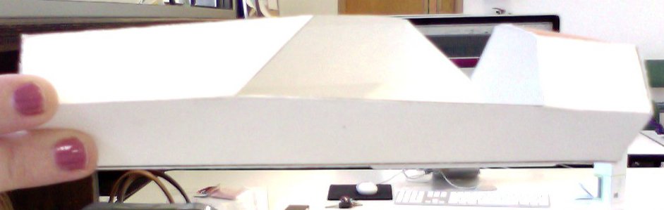
I was happy with my Pico design. I bought the Magic Model clay and put it in the bottom of the package to hold the Pico in -- the color isn't great but there was no white and I figured that this color was close enough. 


Thursday, April 5, 2012

Project 3: Package Design [Formal Critique]

Here are my designs for my critique:


Suggestions in class:
  •  Make the Pico box thicker
  • Actually create the pico
  • Flip wine opener artwork around
  • More white space on wine opener box
  • open up the triangle on the wine opener box
 I really liked all of these suggestions. Moving forward I'm going to try and find compromising solutions. I really like how these are playing out! I'm excited to see what they look like when they are on sturdier material!