Tuesday, February 28, 2012

Project 2: Furniture Store Identity [Initial designs]

I'm really excited about my final logo design and the beginnings of my designs. I by no means think that they are where they need to be, but I'm feeling great about the start I have. 

Moving forward after discussing with Professor Fender, I want to integrate some great ideas that he suggested. I came up with a "flap" for the promotional mailer that folded up into the logo. He suggested to incorporate that into all of the designs. This will help the pieces look less "corporate". I want it to be a little hipper than it currently is. 

Below are my initial ideas:


Monday, February 20, 2012

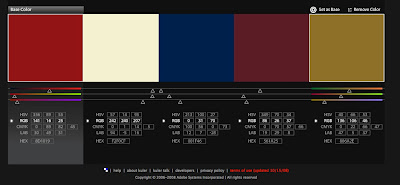
Project 2: Furniture Store Identity [final colors/logo ideas]

In our first class, I talked with Professor Fender about  taking the focus off of baseball. I completely agree. I don't think my logo is there yet. I really want to discuss it before I delve too deeply into other executions. I think the logo plays a huge role in my decisions for those things, especially the smaller items such as the business cards and letter head. I really want a clever idea -- hopefully in class I'll get some inspiration!


Thursday, February 16, 2012

Project 2: Furniture Store Identity [initial brainstorming]

Store Name: Home Run

Even though there is a "baseball pun" I want the title to mean more than "All-American". I get from it that this store carries the essential items to go all the way with your home and make it the best it can be. This store carries those finishing touches and those conversation pieces that your friends never stop talking about.

Color System options:


I want to do something with the diamond and somehow incorporate furniture!

Monday, February 13, 2012

Project 1: Self-Promotional Postcards [final images]

Below are my final images. In critique there were lots of suggestions for making my postcards some sort of gameboard. That just seemed way more childish than I wanted to go. Regardless, I played around with adding squares. I even moved them around to see if it would make the design more dynamic. I even attempted at making the squares circles or breaking up the obvious path. In the end, I curved the edges to make it less harsh. I think this flows better with the hand drawn art.

Regarding the art - I didn't change too much of them. I wanted them to be very informal and I really like how the text couples nicely with them. I changed some of the line thickness in order to make the drawings more uniform, but otherwise, I decided to go with my gut and leave what I liked most about my cards. Besides, they are representing me anyways!

I also added light scribbles to the background. This was my subtle way of breaking up the white space without overpowering what was important in my designs.

Again these are going to designers or potential employers. I wanted to show my snarky personality, while showing my processes and how I think. I think the "timelines" are very clear and give a great representation of who I am as a designer!


Project 1: Self-Promotional Postcards [graphic mockups]

Below are all 4 postcards front and back. I really want to come up with a better solution for all the white space and I want to refine the graphics. I also forgot the arrows in the 4th solution. I want to know if my content is engaging enough, or not. I also want to know how I can spice it up and make it less timeline-ish.

I am also having a hard time attaching myself to these cards. While I really like them and think they truly show my personality and processes, I think I can push them more and come up with more visually interesting elements. I am curious as to what is said in critique.


Thursday, February 9, 2012

Project 1: Self-Promotional Postcards [group critique]

I thought the group critique was extremely helpful. By the time it was my time, people weren't really into it anymore and didn't have anything drastically new to tell me. I just need to rework my drawings and the white space. Otherwise, they surprisingly like my concepts.

I think I'm just plain sick of RE-working things. When I create designs or projects, I always hit that point where I need to step back and take a break. I've obviously hit that point right now. So hopefully I get past it and rework it!